Taiyo Sushi Animated Logo — Brand Identity & Motion Design Portfolio
Taiyo Sushi is a conceptual branding project showcasing expertise in animated logo design, brand identity development, and motion graphics. This portfolio piece demonstrates how minimalist design principles and strategic animation can create memorable brand experiences for the hospitality and food service industry.
Project Overview & Creative Challenge
The goal was to design a distinctive animated logo that captures the essence of Japanese culinary artistry while maintaining modern appeal. The challenge involved balancing simplicity with sophistication—creating a mark that works across digital platforms, from social media to mobile apps, while telling a story about quality, tradition, and precision.
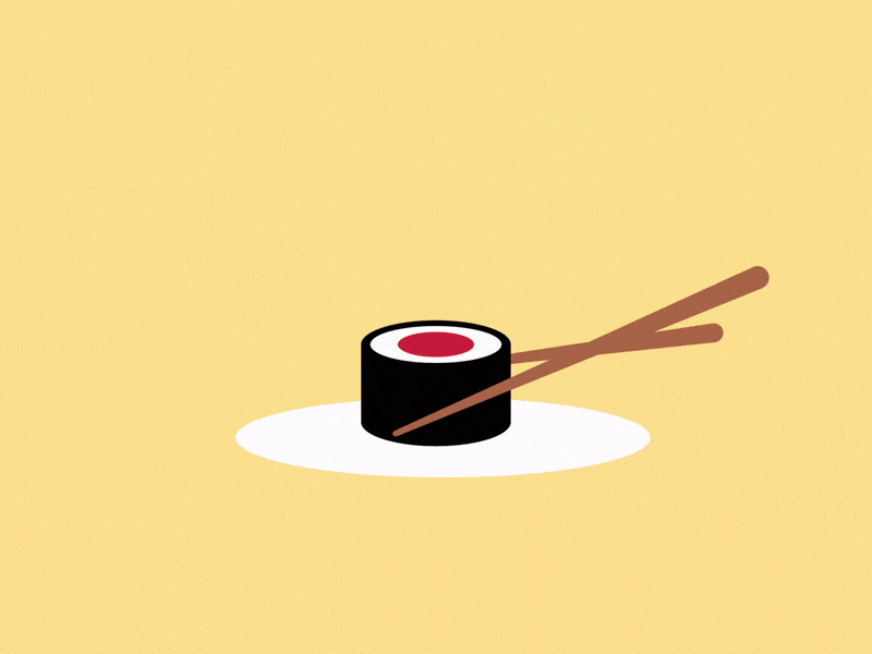
This logo animation features a stylized sushi roll with chopsticks, incorporating smooth, deliberate movements that reflect the mindful preparation of authentic Japanese cuisine. The design leverages negative space, bold color contrasts, and purposeful motion to create instant brand recognition.
Design Process & Methodology
Every great brand identity starts with research and strategy. For Taiyo Sushi, I explored Japanese design aesthetics, studying the principles of ma (negative space) and shibui (subtle elegance). The color palette draws from traditional sushi ingredients: nori black, rice white, and salmon pink—creating an appetizing yet sophisticated visual language.
Motion Design Strategy
The animation sequence was carefully choreographed to evoke the ritual of sushi dining. The chopsticks enter with purpose, the plate appears with grace, and each element settles with intention. Using CSS animations and SVG graphics, I achieved smooth 60fps performance while keeping file sizes minimal for fast web loading.
Technical Implementation
Built with semantic HTML5 and modern CSS3, the animated logo is fully responsive and accessible. The animation respects user preferences through prefers-reduced-motion media queries, ensuring inclusivity without compromising the brand experience for users who enjoy motion design.
Brand Identity System Components
Beyond the animated logo, this portfolio project includes a comprehensive brand identity system:
- Primary Logo: Full-color animated version with chopsticks and sushi
- Static Lockup: Simplified version for print applications
- Color Palette: Warm yellows, deep blacks, and accent reds inspired by Japanese cuisine
- Typography: Clean, modern sans-serif pairing with traditional Japanese aesthetic
- Motion Guidelines: Documentation for consistent animation timing and easing
Tools & Technologies Used
This project showcases proficiency in industry-standard design and development tools:
- Design: Adobe Illustrator, Figma for vector graphics and prototyping
- Animation: CSS3 keyframes, SVG animations, and JavaScript for interactive elements
- Development: HTML5, CSS3, responsive design principles
- Optimization: Performance testing, cross-browser compatibility, accessibility standards
Key Design Decisions & Rationale
The minimalist approach serves multiple purposes: it ensures scalability across different screen sizes, reduces cognitive load for viewers, and creates a timeless aesthetic that won't feel dated. The warm yellow background evokes the ambiance of traditional Japanese restaurants while providing excellent contrast for the black sushi roll.
The animation timing follows the 12 principles of animation, particularly "slow in, slow out" easing to create natural, organic movement. Each element enters the frame with purpose, avoiding chaotic or distracting motion that could undermine the brand's premium positioning.
Applications & Use Cases
This animated logo system is designed for versatility across multiple touchpoints:
- Website Headers: Hero sections and navigation bars
- Social Media: Instagram stories, TikTok intros, YouTube channel branding
- Digital Menus: Tablet and kiosk interfaces for restaurants
- Email Marketing: Animated GIF versions for newsletters
- Presentation Decks: Pitch decks and investor materials
Performance & Optimization
Fast loading times are crucial for user experience and SEO. By using CSS animations instead of heavy video files or JavaScript libraries, the logo loads instantly even on slow connections. The SVG-based graphics scale perfectly from mobile phones to 4K displays without quality loss or increased file size.
SEO & Accessibility Considerations
The code follows WCAG 2.1 guidelines with proper ARIA labels, semantic HTML structure, and keyboard navigation support. Search engines can index the text content while users enjoy the visual enhancement—a best practice for modern web design that balances aesthetics with functionality.
Lessons Learned & Portfolio Value
This project demonstrates my ability to create cohesive brand experiences that work across static and animated formats. It showcases technical proficiency in front-end development while maintaining strong design fundamentals. The Taiyo Sushi logo proves that effective branding doesn't require complexity—thoughtful execution of simple ideas creates lasting impressions.
Let's Work Together
Interested in a custom animated logo or complete brand identity for your restaurant, food service business, or hospitality brand? I specialize in creating memorable motion design that elevates brands and engages audiences. Contact me to discuss how we can bring your brand story to life through strategic design and animation.